Quick answer: The Function Health dashboard is a web-based member portal where you see all 100-plus biomarker results organized by organ system, read a physician-written interpretation of every out-of-range value, and track how your numbers shift over successive draws. After your Quest or Labcorp blood draw, results populate the dashboard within 24 to 72 hours. You reach it at app.functionhealth.com by logging in with the email you used at signup.
What the Function Health dashboard actually looks like on first login
The first screen after login is a summary home page that shows the date of your most recent draw, a count of how many biomarkers were flagged (either above or below the lab reference range), and a quick-access bar for your primary organ categories. It is intentionally minimal because Function Health bets that the detail lives one click deeper, not on the landing view.
Before you pick a dashboard to track your health on, see what a 100+ biomarker panel with physician review actually looks like. One at-home Superpower draw checks 100+ biomarkers, physician-reviewed.
The left-hand navigation panel has five main sections: Results, Trends, Recommendations, Account, and Help. New members sometimes look for a dedicated app, but as of 2026 Function Health is a progressive web app accessed through a mobile browser or desktop browser, not a native iOS or Android application. For a broader look at what the experience feels like from signup through draw, see our function health app review.
One thing that catches first-timers off guard: the function health dashboard does not show your raw PDF lab report by default. The PDF exists and is downloadable (look for the “Export” or “Download Results” button at the top right of any category page), but the primary view is Function Health’s own interpreted layout, not the standard Quest or Labcorp printout with its generic flagging. That is a meaningful difference because Function Health uses tighter-than-standard reference ranges for many markers.
How to read the Results section: organ systems and biomarker cards
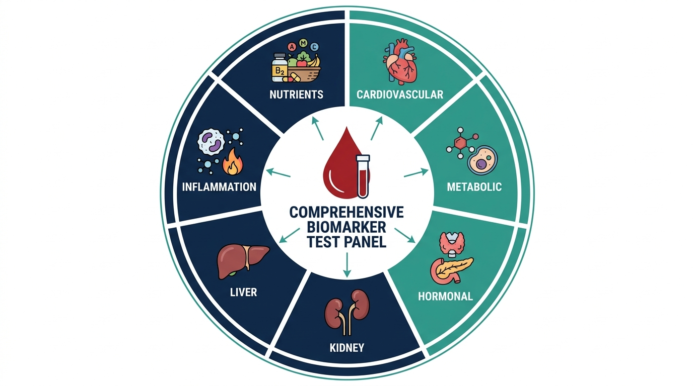
The Results section is the heart of the function health results dashboard. Biomarkers are grouped into roughly 14 organ-system categories rather than listed alphabetically or by panel, which is far more clinically useful than how a standard lab printout organizes the same data.
Common categories include Metabolic Health, Thyroid, Heart and Cardiovascular, Hormones (split by sex), Liver and Kidneys, Inflammation, Nutrients and Vitamins, Blood and Immune, and Biological Age. Each category card on the summary screen shows a small colored indicator: green for all in range, yellow for borderline, red for out of range. Clicking a category opens a list of every individual biomarker tested within it.
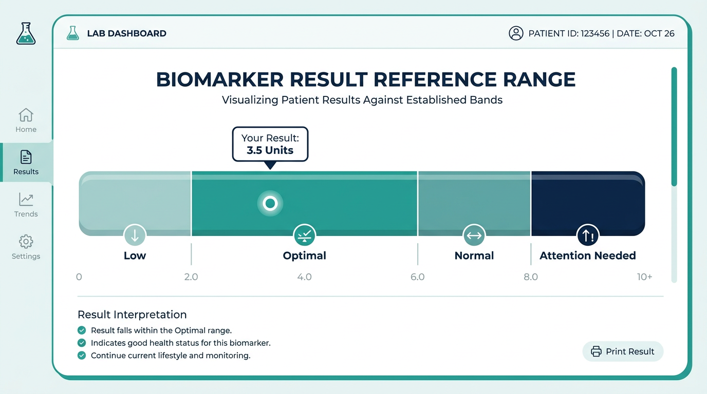
Each biomarker card shows four things: your numerical result, the unit of measurement, the reference range Function Health uses (often different from the Quest or Labcorp population range), and a color-coded status. Below that is a short plain-language explanation of what the marker measures and, if yours is flagged, a paragraph written or reviewed by a physician explaining what the value may mean and whether to act on it.
A detail that matters: Function Health uses what they call “functional” or “optimal” ranges, not just statistical population averages. For example, their TSH optimal range typically runs from about 1.0 to 2.5 mIU/L, while the standard lab range goes up to 4.5 or 5.0. A result that looks normal on your doctor’s printout can show up yellow in the function health dashboard. This is one of the genuine values the platform offers, but it also means you may see more flags than you expect. If you are sorting out whether that extra flagging is signal or noise, our function health review covers the tradeoffs honestly.
How the Trends section works: reading your numbers over time
Trends is where the function health dashboard earns its membership fee for returning members. Every biomarker with more than one recorded result plots automatically on a time-series line chart. The x-axis shows draw dates, the y-axis shows the numeric value, and the shaded band shows the target range. You can see at a glance whether your LDL or your hemoglobin A1c is moving in the right direction after a dietary change or medication adjustment.
A few practical notes on navigating function health dashboard trend charts. First, the scale auto-adjusts to your personal range of results, so a line that looks flat may actually represent a clinically meaningful absolute change. Always check the y-axis numbers, not just the visual slope. Second, hovering over any data point shows the exact result and date. Third, if you have had only one draw, the Trends tab will show a single point with no line, which looks a bit sparse but will fill in after your second annual draw.
Function Health allows you to export trend data as a CSV, which is useful if you want to share a multi-year history with a new clinician or load it into your own spreadsheet. The export icon appears in the upper right corner of the Trends view.
Where to find your doctor’s notes and recommendations
The Recommendations section surfaces physician-written action items tied to your specific flagged results. These are not generic pop-up wellness tips. If your ferritin is low, the recommendation will say something like “consider a full iron panel including TIBC and iron saturation to rule out iron-deficiency anemia before starting supplementation” rather than “eat more leafy greens.” The quality of these notes is one of the main things that separates Function Health from raw lab ordering services like Walk-In Lab or Ulta Lab Tests, where you get numbers with no interpretation.
Each recommendation card links back to the specific biomarker that triggered it, so you can jump between the recommendation and the underlying result without losing your place. If a recommendation references following up with a clinician, that is the moment to actually call your primary care doctor or specialist rather than trying to self-manage a potentially significant finding. Function Health is explicit that its physician notes are educational context, not a treatment plan.
Recommendations also appear inline within the biomarker cards in the Results section (a small “View recommendation” link), so you do not have to leave the Results view to see the guidance if you prefer to read marker by marker.
The Biological Age feature and what it actually measures
The Biological Age section is one of the most-clicked areas of the function health dashboard, partly because it produces a single number people want to share. Function Health calculates a biological age estimate by running a proprietary algorithm across dozens of your biomarkers, weighting metabolic, inflammatory, and hormonal markers more heavily than standard population-based actuarial models do.
The number itself is most useful as a direction-of-change signal rather than an absolute truth. A biological age of 38 when your chronological age is 44 tells you something. Whether that 38 is exactly correct by any gold-standard measure is harder to verify. Function Health does not publish the specific algorithm, which is a fair criticism. What it does do is recalculate after each draw, so you can see whether lifestyle changes are pushing the estimate younger or older over time.
The section also breaks down which biomarker categories are contributing most to an older biological age estimate, giving you a prioritized list of where to focus. If inflammation and blood sugar are the primary drivers, that is actionable in a way that a generic “your age is 38” is not.
Account settings, draw history, and how to access past results
The Account section handles your membership details, payment method, scheduled draw cadence, and personal health history. It is also where you find a full archive of every previous draw in chronological order, accessible as both the Function Health interpreted view and as a downloadable PDF of the original lab report.
One underused feature: the Health History form in Account lets you input ongoing conditions, medications, and supplements. Function Health’s physician reviewers can see this context when writing your recommendations, which in theory improves the relevance of their notes. In practice, members who fill this out tend to get more nuanced annotations on borderline results (for example, noting that a slightly elevated LDL in someone on a low-carb diet has a different risk profile than the same number in a sedentary person with metabolic syndrome).
If you have questions that the dashboard cannot answer, the Help section links to a knowledge base and to Function Health’s support contact options. See our separate piece on function health customer service contact if you need to reach a human quickly, since the routing is not always obvious from inside the dashboard itself.
Mobile experience: using the function health dashboard on a phone
Because Function Health is a progressive web app rather than a native mobile app, the experience on iOS and Android is a mobile-browser session rather than an app you download from the App Store or Google Play. The dashboard is responsive and readable on a phone screen, but the trend charts in particular are easier to read on a larger screen where you can see the full time axis without horizontal scrolling.
The practical workaround for iPhone users: visit app.functionhealth.com in Safari, then tap the Share icon and choose “Add to Home Screen.” This creates a home screen shortcut that opens full-screen without browser chrome, which gets you fairly close to a native app experience. Android users can do the same through Chrome’s “Add to Home Screen” prompt.
Push notifications for new results are not available through the progressive web app as of early 2026. You receive an email when results are ready, which then links you directly to the dashboard. The email link is draw-specific, meaning it deep-links to that draw’s results rather than dropping you on the home screen.
How the function health dashboard compares to Superpower and similar platforms
Function Health and Superpower are the two most feature-complete physician-reviewed lab membership services available in the US in 2026, and members often ask how their dashboards differ once you are actually inside them. Both show biomarkers by organ system, both provide physician notes, and both track trends over time.
The clearest difference is that Superpower assigns you a named physician who reviews your results personally and is available for a one-on-one consultation, while Function Health’s physician notes are written by a clinical team and may or may not reflect a single reviewing doctor. For members who want a face and a phone number attached to their recommendations, that matters. For members who want pure data density and a well-organized self-serve interface, Function Health’s dashboard is arguably cleaner. See our superpower blood test review for a detailed comparison of what each service includes at its membership price.
The simplest way to actually get this done
Superpower is a full-body lab membership that runs 100+ biomarkers, has each result reviewed by a doctor, and tracks your numbers year over year (about $199/year). It is what we point readers to when they would rather get one clean, complete draw than chase single tests one at a time. Here is superpower reviewed in full.
What the Function Health dashboard does not show you (and where to go instead)
A few gaps are worth knowing about before your first draw. The function health dashboard does not show imaging results, genetic data, or continuous glucose monitor data in the same interface, even though Function Health has discussed adding integrations over time. If you are wearing a CGM and hoping to see blood glucose trends from the device layered against your A1c or fasting glucose from your blood draw, you will need to do that comparison manually between the CGM app and the Function Health dashboard.
The dashboard also does not show you a severity ranking across all flagged markers. If you have 15 out-of-range results, Function Health does not automatically tell you that three of them are clinically urgent and 12 are mild borderline findings. You have to read the physician notes on each flag to triage that yourself, or bring the full export to a clinician who can prioritize for you. That is a real usability gap for members with complex labs.
Finally, the dashboard does not track prescription medications or connect directly with your pharmacy. The Health History input is manual. For members looking for a more integrated longitudinal health record, the Function Health dashboard is best thought of as a specialized lab-result viewer rather than a full personal health record (PHR) platform.
Common issues logging in and accessing your results
If you cannot reach your function health dashboard, the most common causes are a session timeout (Function Health logs you out after inactivity, often around 30 minutes), a browser that has cookies or JavaScript disabled, or an email mismatch if you have multiple email addresses and signed up with one but are trying to log in with another. The login page is at app.functionhealth.com, not functionhealth.com, which catches people who bookmark the marketing site.
Results that seem missing after your draw date are usually a processing lag rather than a technical error. Quest and Labcorp process most panels within 24 to 48 hours, but certain specialty tests (hormone panels, some thyroid markers, advanced lipid fractions) can take up to five business days. Function Health’s support team can confirm which specific tests are still pending if you are past the 72-hour mark and the dashboard still shows incomplete results. For more on this see our piece on how to read function health results step by step.
| Section | What you find there | Typical use |
|---|---|---|
| Results | All biomarkers grouped by organ system, color-coded status, physician notes per flagged marker | First review after each draw |
| Trends | Time-series charts for every marker with 2 or more draws, CSV export | Checking progress between draws |
| Recommendations | Physician-written action items linked to specific out-of-range markers | Deciding what to follow up on or discuss with a clinician |
| Biological Age | Algorithm-derived age estimate, category breakdown of drivers | Longitudinal direction-of-change signal |
| Account | Draw history, archived PDFs, health history form, payment settings | Accessing past results, updating medications and supplements |
| Help | Knowledge base, support contact links | Technical issues, billing questions |
Curious what your own levels look like?
Baseline 100+ biomarkers today and retest as life changes, all in one membership with physician review.
FAQ
How do I log in to the Function Health dashboard?
Go to app.functionhealth.com and sign in with the email address you used when you created your account. If you forgot your password, the “Forgot password” link on the login screen sends a reset email within a few minutes. Make sure you are on the app subdomain, not the main marketing site, which does not have a login portal.
How long after my blood draw will results appear in my function health dashboard?
Most routine biomarkers (metabolic panel, CBC, standard lipids) appear within 24 to 48 hours of your draw. Specialty panels including detailed hormone profiles, advanced thyroid markers, and certain nutrient assays can take 3 to 5 business days. Function Health sends an email notification when your full results are ready, so you do not need to keep checking the dashboard manually.
Can I share my function health dashboard results with my doctor?
Yes. Each biomarker category and the full draw can be exported as a PDF report that includes the same information your doctor would see on a standard lab printout, plus Function Health’s reference ranges. You can also download a CSV of all numerical results for use in spreadsheets or other health apps. Many members bring the PDF to their primary care physician to review alongside the Function Health physician notes.
Why does the function health dashboard show more out-of-range results than my regular doctor’s labs?
Function Health uses tighter “optimal” reference ranges for many markers rather than the population-normal ranges that commercial labs like Quest and Labcorp use. A TSH of 3.8, for example, falls within the standard lab range but outside Function Health’s tighter optimal range. This is a deliberate clinical philosophy, not a data error. Whether the tighter ranges are more clinically meaningful for your specific situation is a conversation worth having with a clinician.
Is there a Function Health mobile app separate from the dashboard?
As of 2026, Function Health does not have a standalone native app in the iOS App Store or Google Play. The member portal is a progressive web app (PWA) accessed through your mobile browser. You can add it to your iPhone or Android home screen via the browser’s Share or Install options to get a near-native experience without opening a browser tab each time.
How do I read the Trends section if I have only had one blood draw?
With a single draw, the Trends section shows one data point per biomarker and no line connecting them, which looks sparse but is functioning correctly. The trend line populates automatically after your second draw. Function Health’s annual membership model is built around a minimum of one draw per year, and the Trends feature becomes its most useful after the second or third data point.
Can I add my own test results from Quest or Labcorp to the function health dashboard?
Function Health does not currently support importing external lab results from outside the service. The dashboard only displays results from draws coordinated through Function Health’s own process at Quest or Labcorp partner sites. If you have historical lab data you want to track alongside your Function Health numbers, you would need to manage that comparison in a separate spreadsheet or personal health record tool.
What does the Biological Age score mean and how accurate is it?
Function Health’s biological age estimate is a proprietary composite score derived from your biomarker results, weighted toward metabolic, inflammatory, and cardiovascular markers. It is useful as a relative signal over time (is your biological age moving younger or older between draws?) rather than as an absolute validated clinical measurement. The algorithm is not published, so independent validation is limited. Treat it as a motivational direction indicator, not a clinical diagnosis.
How is the function health dashboard different from what I get with a standard doctor visit?
A standard annual physical with a primary care physician typically includes a basic metabolic panel, CBC, TSH, and lipid panel, which is around 20 to 30 biomarkers. The function health dashboard displays 100-plus biomarkers per draw, organized visually by organ system, with optimal reference ranges and physician notes on flagged values. The depth of data is genuinely different. What the dashboard does not replace is the physical examination, the ongoing patient-physician relationship, and the ability to prescribe treatment if something is seriously wrong. Talk to a clinician about any result that concerns you.
How does Function Health’s dashboard compare to Superpower’s?
Both platforms organize biomarkers by organ system, both provide physician-written interpretations, and both track trends over time. Superpower pairs each member with a named physician who is available for a personal consultation included in the membership fee, while Function Health’s notes come from a clinical review team without a guaranteed one-on-one call. For cost details on either platform, see our breakdowns of function health cost and how much does superpower cost.
Vital Signs Today may earn a commission if you buy through links on this page. It does not affect our editorial assessments.